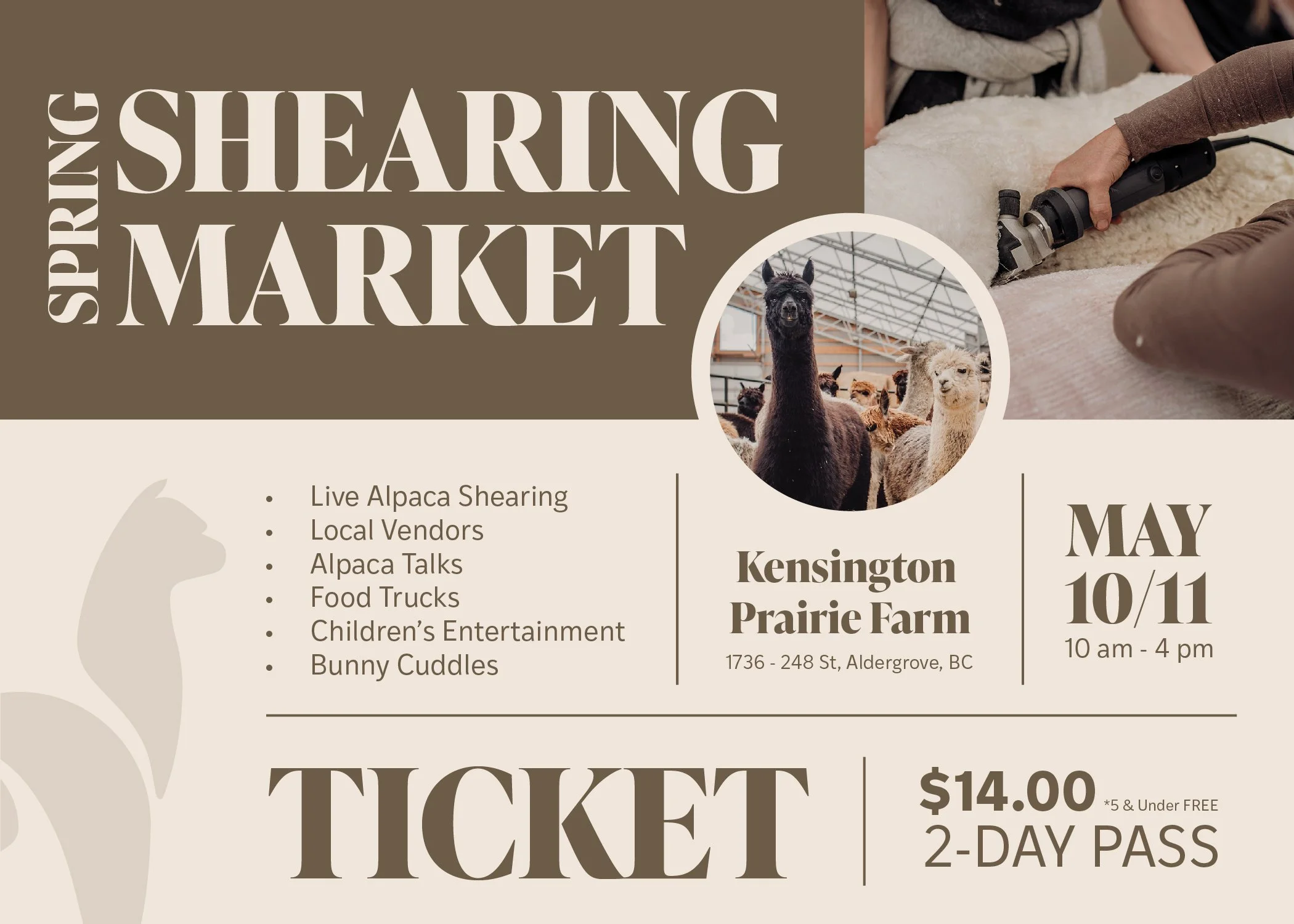
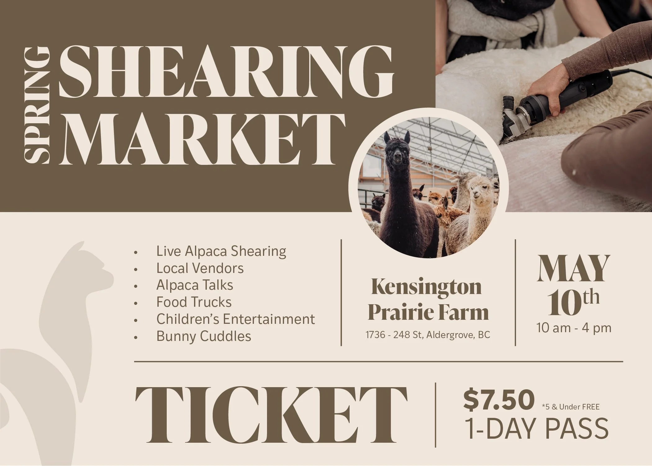
Spring Shearing Market
PRINT COLLATERAL
YEAR
2025
THE CLIENT
Kensington Prairie Farm
THE CHALLENGE

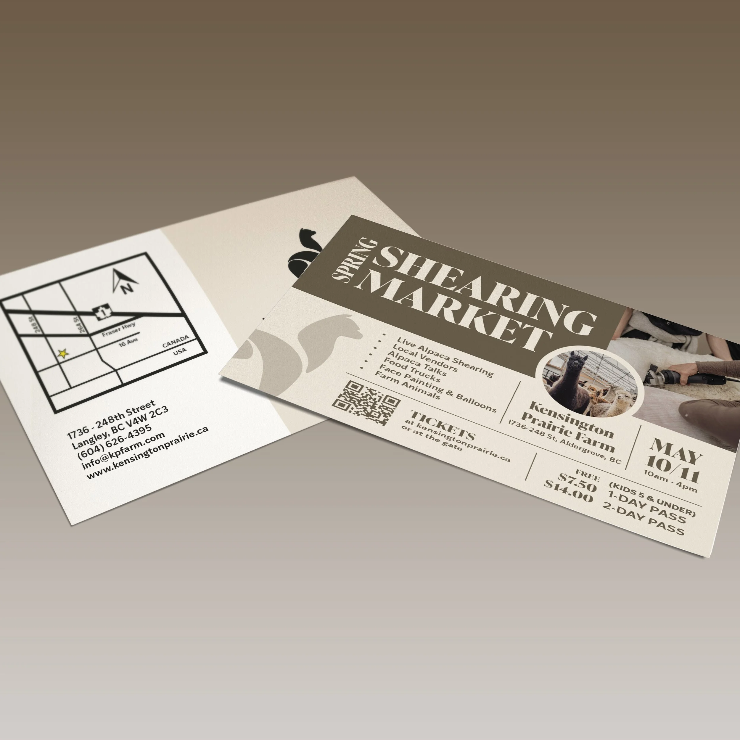
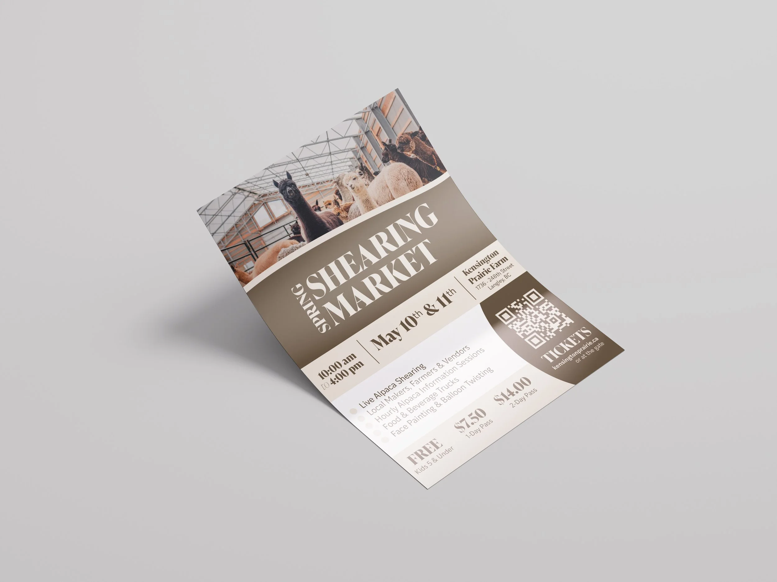
Generate attention and awareness for an annual market through an informative poster design, postcards and tickets.
THE SOLUTION
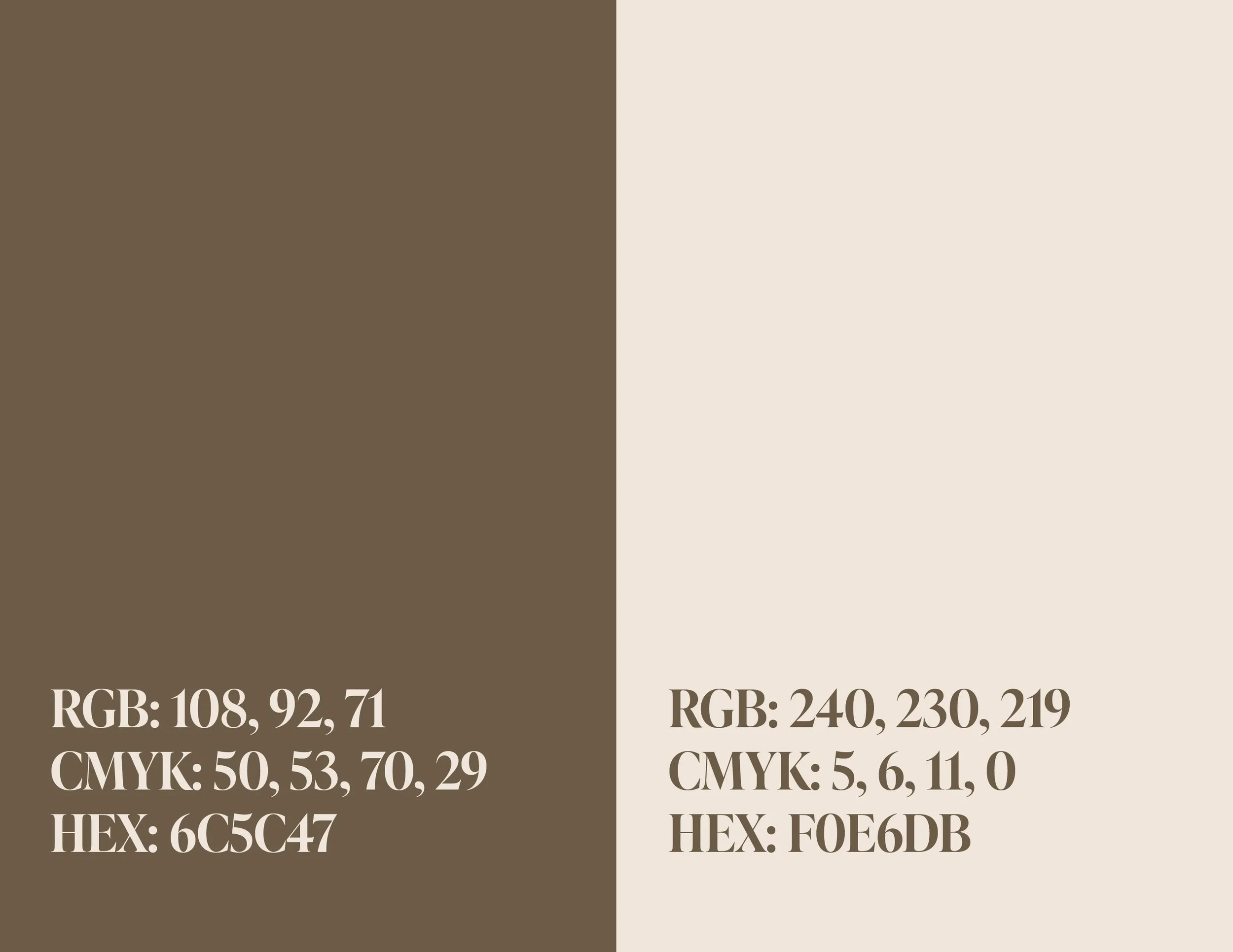
Inspiration was taken from the beautiful brown hues in the alpaca fibre that are ever so carefully sorted and graded at the Spring Shearing Market. The event logo was crafted using a sans serif font that keeps the classiness of the farm & boutique shop, as well as is it being easy to read on big headers.
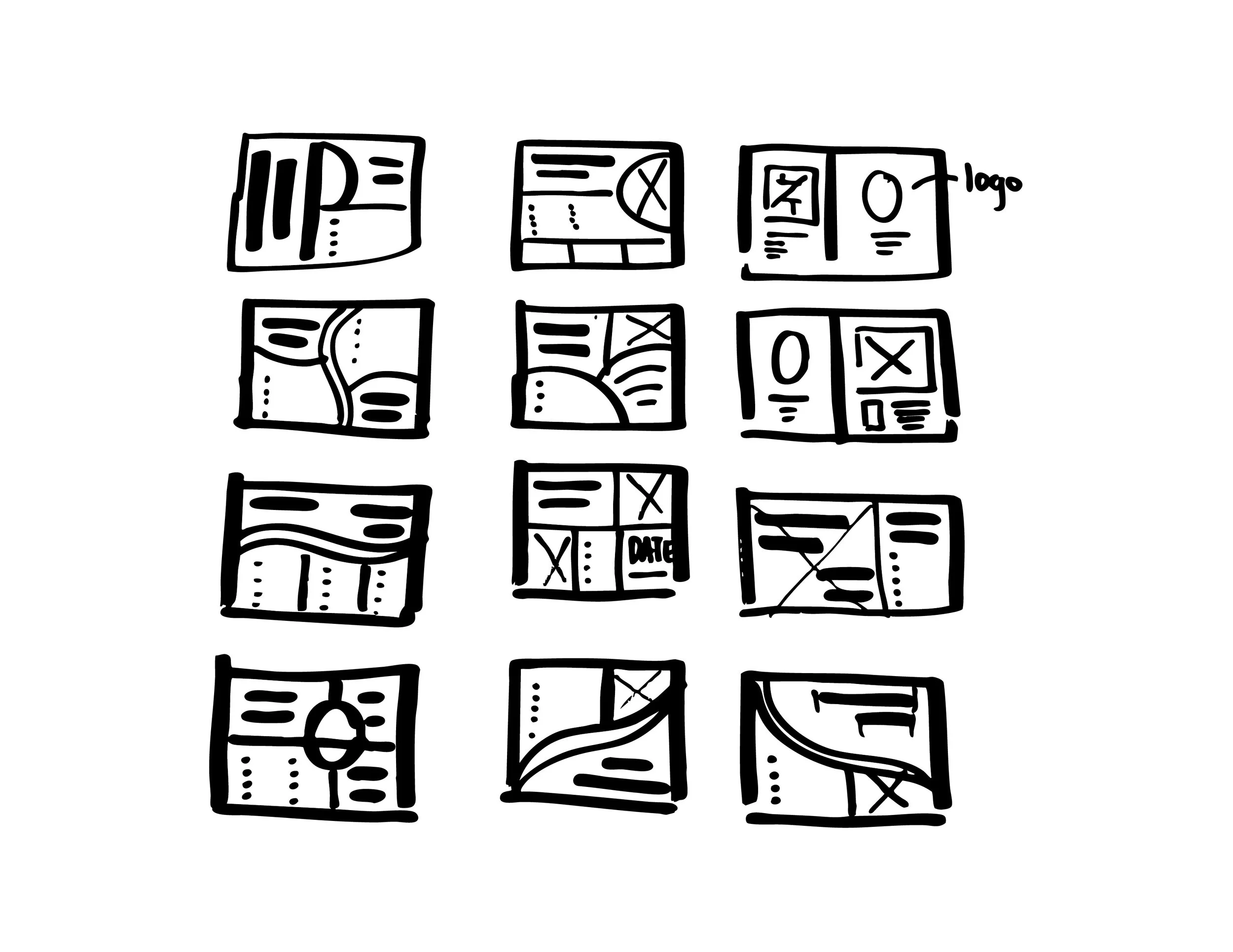
All of the print items were designed alike in their styles to ensure a cohesive and professional looking event. I overcame the layout challenge by using curved lines, images, shortened phrases, and hierarchy to ensure a readable and attractive end result.
The event was a huge success and all print material was successfully printed and distributed and the client was happy with the end result.