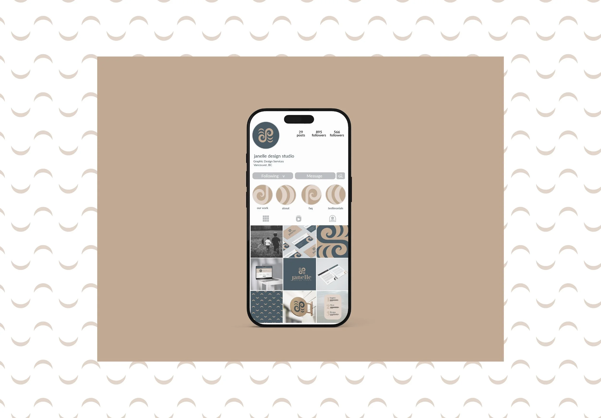
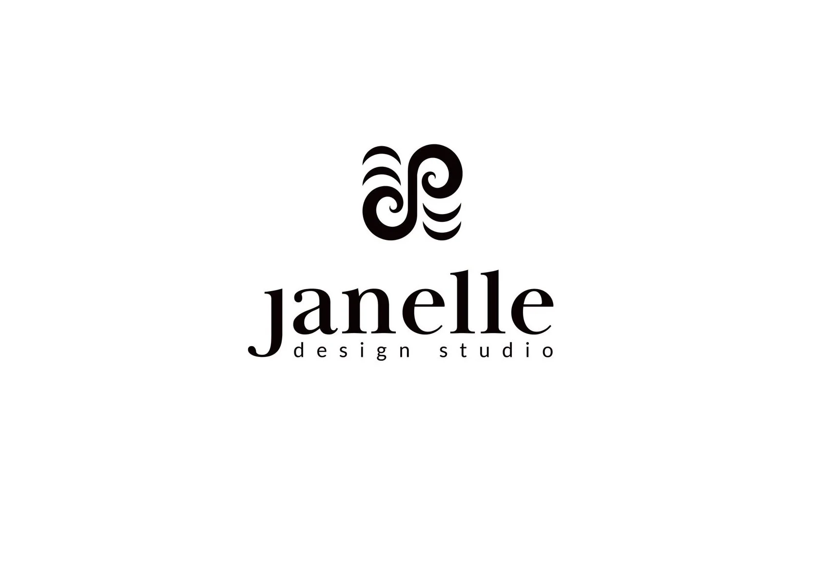
Janelle Design Studio
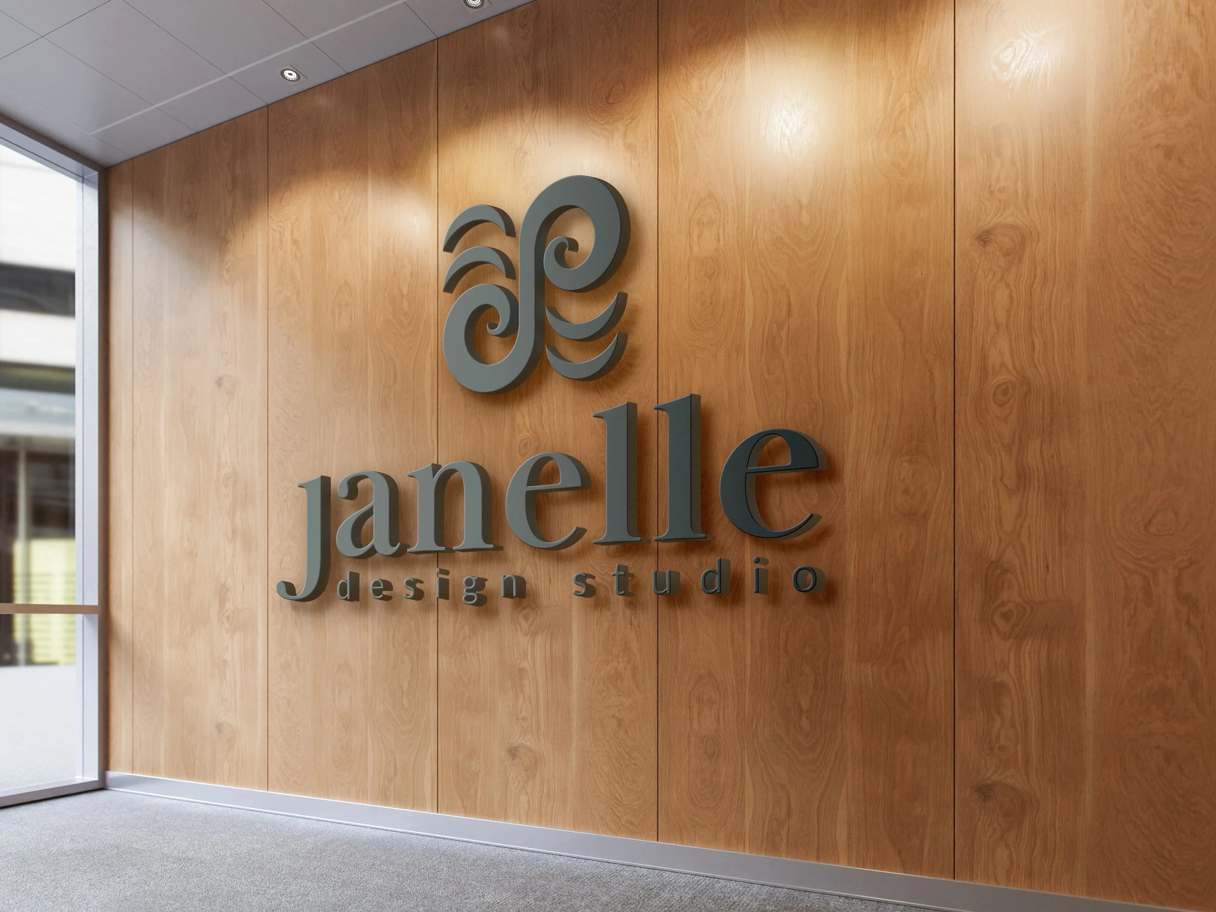
LOGO DESIGN
BRAND IDENTITY
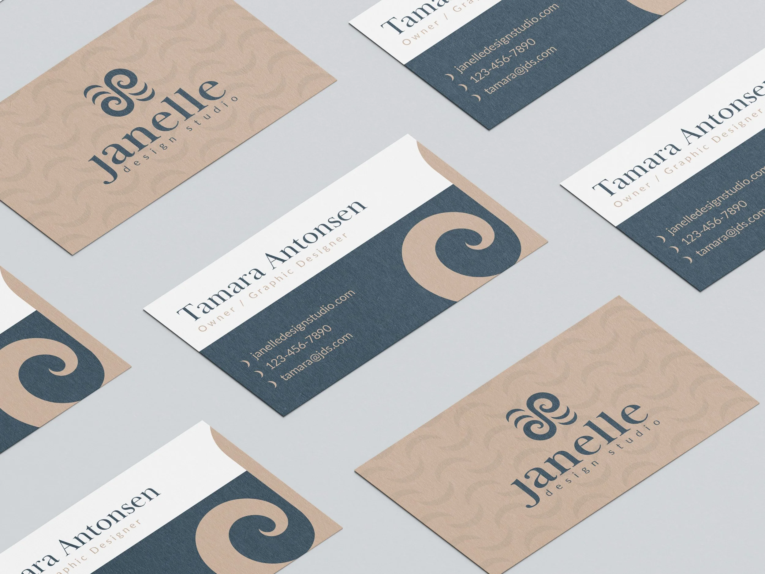
PRINT COLLATERAL
YEAR
2024
THE CLIENT
BCIT School Project
THE CHALLENGE
A personal brand project that reflects my true values and unique design approach.
THE SOLUTION
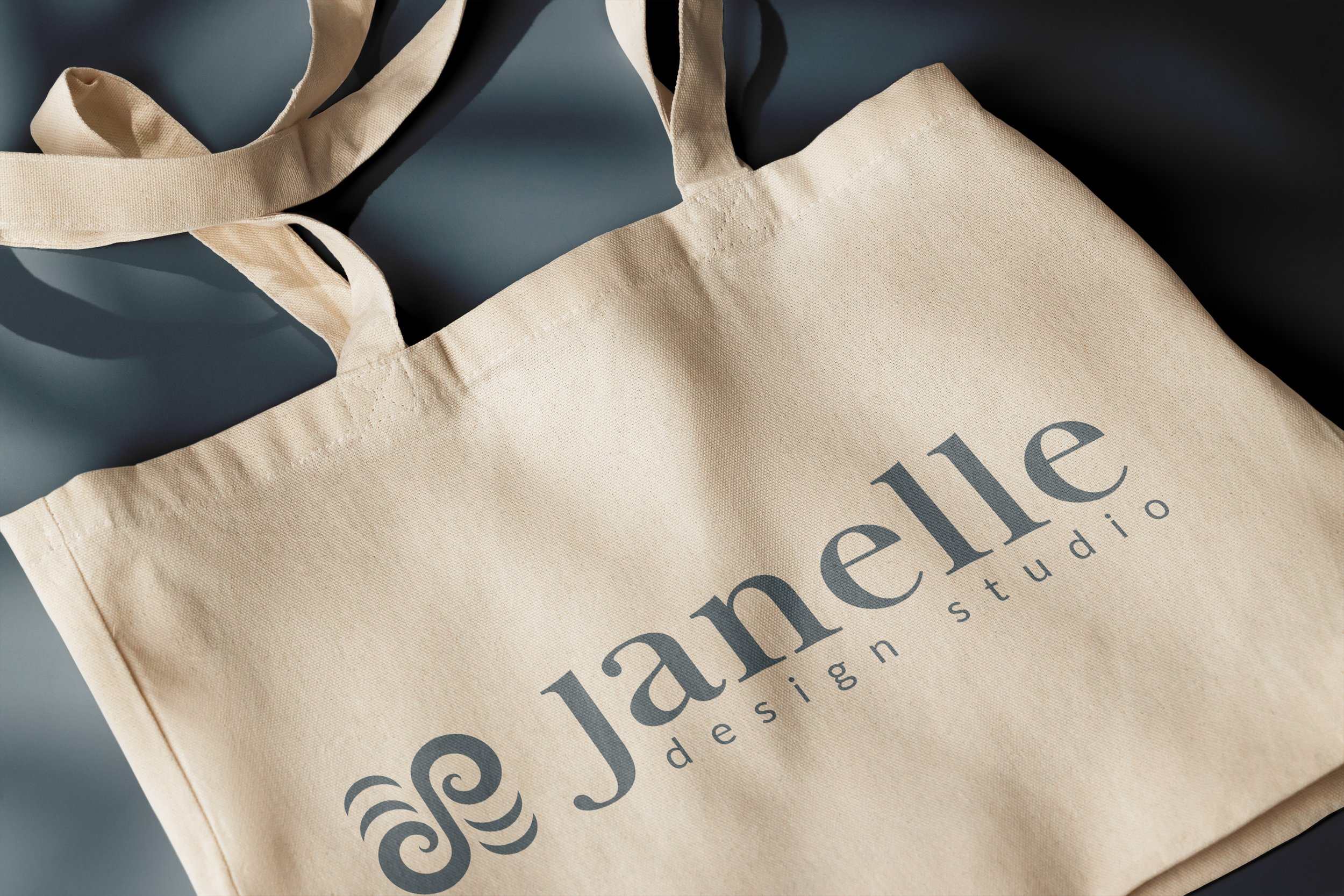
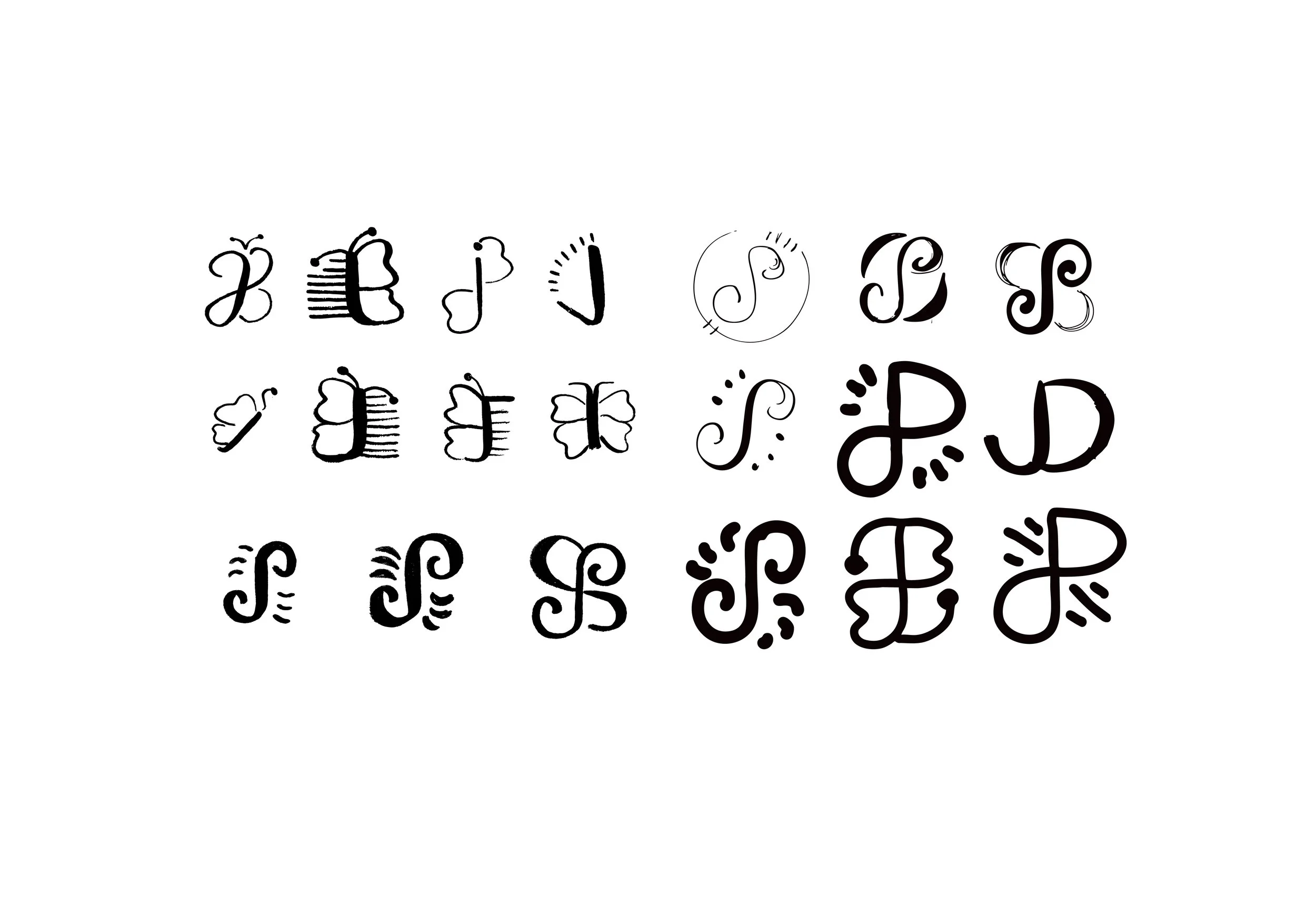
This logo reflects important values of my past, present & future self. It is also a representation of the transformational process that takes place when working with clients on creative projects. Overall, I wanted the logo to feel organic, joyful, playful, organized, and balanced.
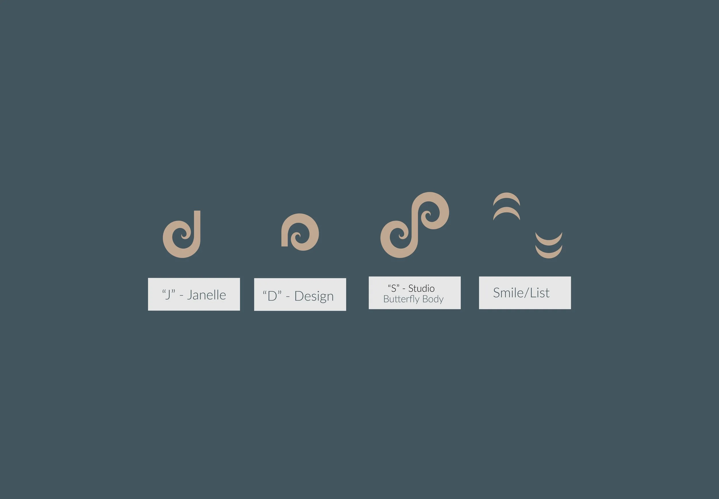
The butterfly was initially integrated into the design as being symbolic for its naturally balanced figure (to represent balance in my life), but then also became the foundation for the letters in my brand name and meaning behind the tagline “soulful creator” as well. Butterflies represent one’s soul as well as transformation, meaningful to the designer & client duo who work to strengthen a brand/project through a creative process, putting heart and soul to make it more personal.
Letters from the brand name “Janelle Design Studio” were tied into the butterfly’s main body using curved lines at varying weights to ensure a more organic look. The detached crescent shapes are important pieces which signify not only a joyful smile, but also priorities and list making - both relevant to my everyday life.
The Why
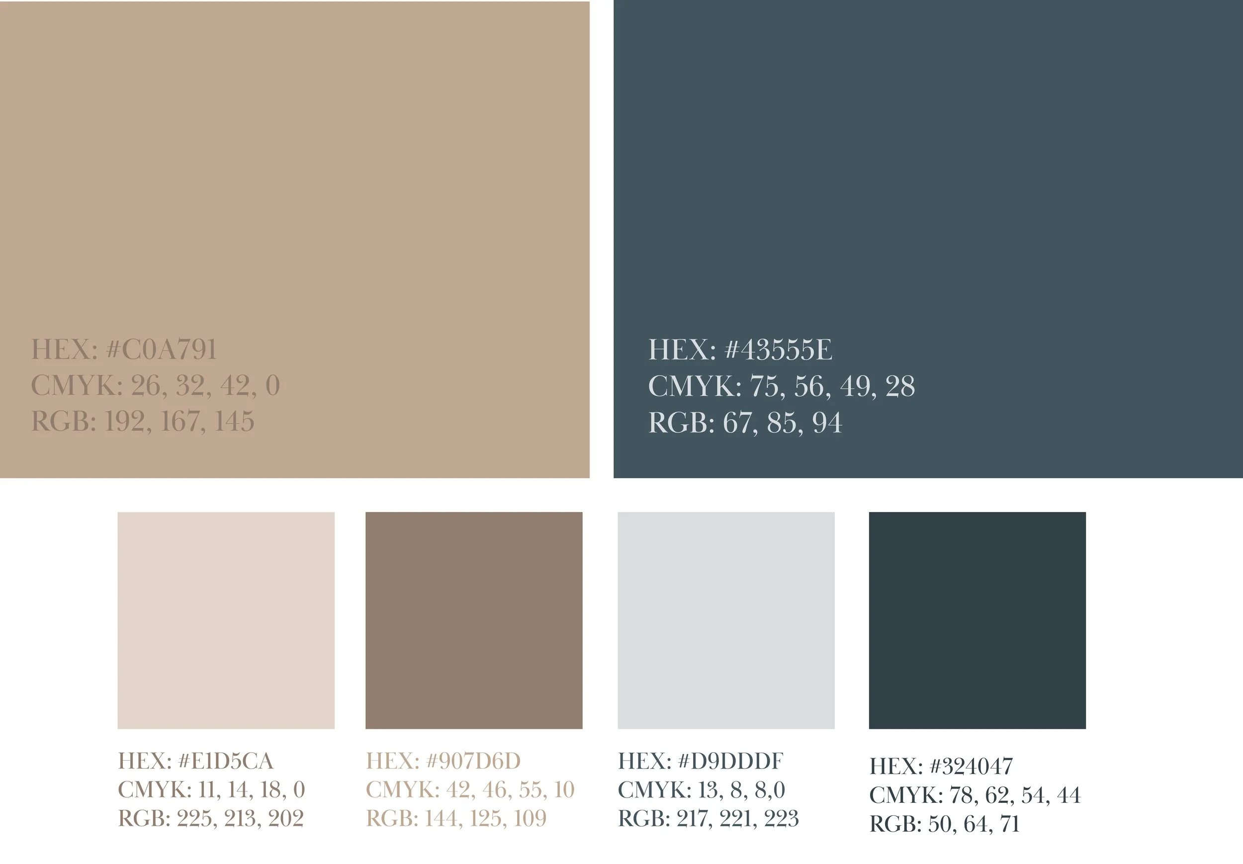
I used a complementary colour scheme, pairing a dark shade of blue with a light tint of orange. It was important to me to have these two colours be a high contrast while feeling easy, soft and comfortable to look at.
Blue
professional, stable, calm
Tan
warmth & comfort